
marsilea.plotter.Point#
- class Point(*args, **kwargs)#
Bases:
_SeabornBaseWrapper for seaborn’s pointplot
Note
About data format
You can only use wide-format for this plot, the number of columns of your input data should match your main data, this allow the data to be split and reorder if split and cluster is applied.
The number of rows is up to you. Rows are the observations, and nothing is aligned to them, so groups of unequal size can be padded with
NaNto keep the input rectangular. Padding stays out of the plot and out of the tests:pd.DataFrame({'A': pd.Series(a), 'B': pd.Series(b)})
- Parameters:
- datanp.ndarray, pd.DataFrame
The wide-format data. To input ‘hue’ like data, you need to input a dict. eg:
{'hue1': data1, 'hue2': data2}.- hue_orderarray of str
The order of hue
- palettedict of label, color
- labelstr
The label of your data
- legend_kwsdict
Configurations for legend
- group_kwsdict
Configurations that apply to each group, should be something like
{'colors': ['C0', 'C1', 'C2']}if you have three groups.- kwargs
Examples
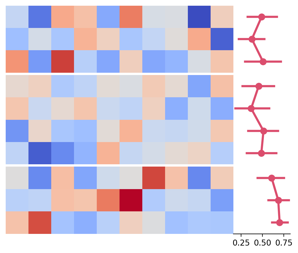
To render seaborn plots as side plots
>>> import marsilea as ma
>>> from marsilea.plotter import Point
>>> data = np.random.randn(10, 10)
>>> sdata = np.random.rand(10, 10)
>>> plot = Point(sdata, color='#DB4D6D')
>>> h = ma.Heatmap(data)
>>> h.cut_rows(cut=[3, 7])
>>> h.add_right(plot)
>>> h.render()
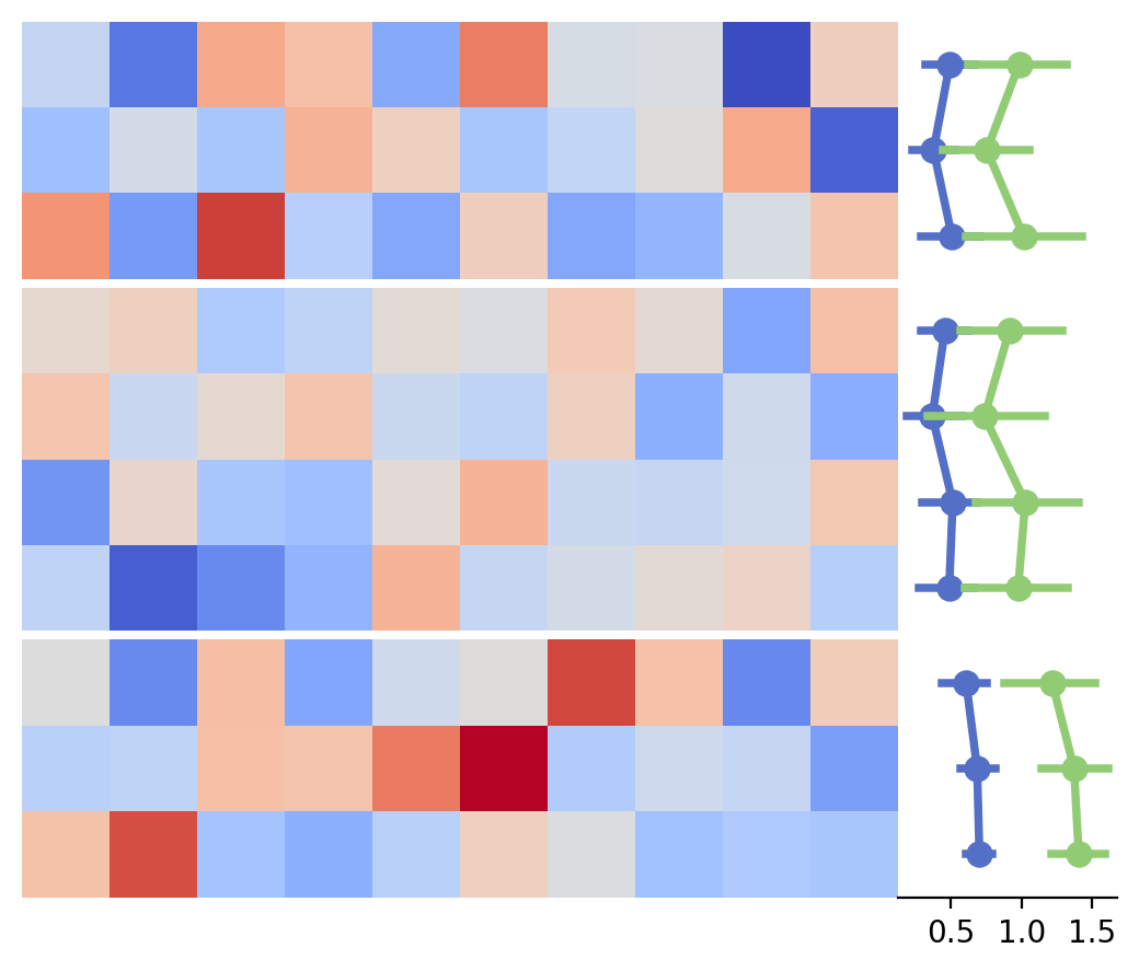
It’s possible to add hue data
>>> plot = Point({'a': sdata, 'b': sdata * 2}, color='#DB4D6D')
>>> h = ma.Heatmap(data)
>>> h.cut_rows(cut=[3, 7])
>>> h.add_right(plot)
>>> h.render()
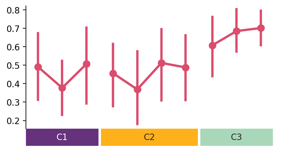
You can also draw it on the main canvas
>>> plot = Point(sdata, color='#DB4D6D')
>>> colors = ['#66327C', '#FFB11B', '#A8D8B9']
>>> anno = ma.plotter.Chunk(['C1', 'C2', 'C3'], colors, padding=10)
>>> cb = ma.ClusterBoard(data, height=2, margin=.5)
>>> cb.add_layer(plot)
>>> cb.cut_cols([3, 7])
>>> cb.add_bottom(anno)
>>> cb.render()
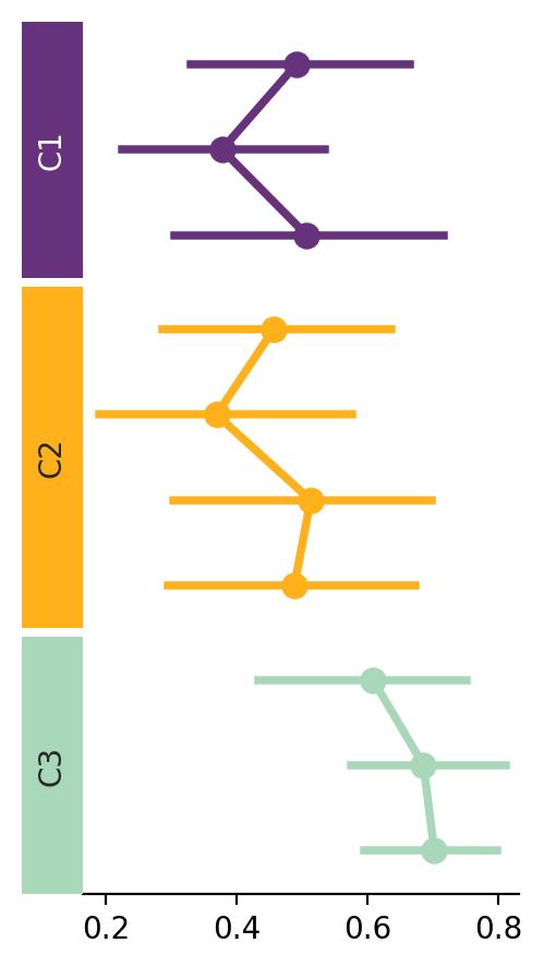
To layout in a different orient and style each group
>>> plot = Point(sdata, orient='h',
...                   group_kws={'color': colors})
>>> anno = ma.plotter.Chunk(['C1', 'C2', 'C3'], colors, padding=10)
>>> cb = ma.ClusterBoard(data.T, width=2)
>>> cb.add_layer(plot)
>>> cb.cut_rows([3, 7])
>>> cb.add_left(anno)
>>> cb.render()
Significance can be tested and drawn on the plot with
Point.annotate_stats(), documented below, which needspip install marsilea[stats]>>> plot = Point({'a': sdata, 'b': sdata * 2}, color='#DB4D6D') >>> plot.annotate_stats(pairs='hue', text_format='star') >>> h = ma.Heatmap(data) >>> h.add_right(plot) >>> h.render()
- Point.annotate_stats(pairs, test='Mann-Whitney', ref=None, pvalues=None, **configure_kws)#
Test pairs of categories and draw the result on the plot.
The tests come from statannotations, installed with
pip install marsilea[stats]. Marsilea draws the brackets, so a comparison spanning two groups of a split canvas looks like any other.Categories are named with the columns of the input data; when the input is a plain array they are named by position (0, 1, 2, …). When the canvas is split, a pair whose two members land in different groups is bracketed across their axes, above the within-group brackets it passes over.
Strip,SwarmandPointdraw their hue levels on top of each other unless givendodge=True; comparisons between overlaid levels are skipped with a warning.- Parameters:
- pairslist of pairs, “hue” or “all”
In an explicit list, each side of a pair is a category label,
("A", "B"), or a(category, hue_level)tuple when the data has hue,(("A", "WT"), ("A", "KO"))."hue"compares the hue levels inside every category;"all"compares the categories with each other, staying inside each group when the canvas is split.- teststr, default: “Mann-Whitney”
The statistical test, see
statannotations.Annotator.Annotator.configure(). Ignored when pvalues is given.- refstr, optional
Reduce a shorthand to comparisons against one reference: a hue level for
pairs="hue", a category label forpairs="all". A category reference reaches into every group, not just its own.- pvaluesarray, optional
Skip testing and annotate these p-values instead, one per pair, in the order the pairs were listed. Needs an explicit pairs list.
- configure_kws
How the result is computed and shown.
alphaandcomparisons_correction(which needsstatsmodels) reach statannotations’ statistics;text_format,pvalue_thresholdsand the rest ofstatannotations.PValueFormat.PValueFormat’s options shape the label;color,line_width,text_offsetandfontsizestyle the bracket. An unknown name is an error rather than silently ignored.The correction covers every comparison drawn on the plot at once, so a split canvas is one family of tests, not one per group.
- Returns:
- self
Examples
>>> import marsilea as ma
>>> import marsilea.plotter as mp
>>> box = mp.Box({"WT": wt, "KO": ko})
>>> box.annotate_stats(
...     pairs="hue", test="Mann-Whitney", text_format="star"
... )
>>> h = ma.Heatmap(data)
>>> h.add_top(box, size=2)
>>> h.render()