Introduction: Real World Example#
Now that you get a general idea of how to create composable visualization in Marsilea. Let’s apply it on a real dataset.
Load Dataset#
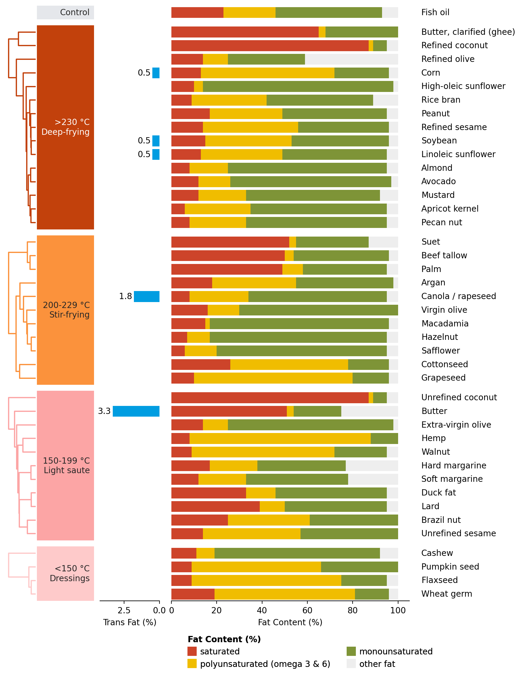
We use a cooking oils dataset. This dataset contains the fat content in cooking oils.
>>> import marsilea as ma
>>> import marsilea.plotter as mp
>>> data = ma.load_data('cooking_oils')
>>> fat_content = data[['saturated', 'polyunsaturated (omega 3 & 6)',
...                     'monounsaturated', 'other fat']]
The main feature is the fat content. Let’s visualize it with stack bar plot.
Create main canvas#
Like what we’ve introduced in the previous section, the main canvas must be
created first. Here, we create an empty ClusterBoard.
Define some colors and create a stack bar plot.
>>> red, yellow, green, gray, blue = "#cd442a", "#f0bd00", "#7e9437", "#eee", "#009de1"
>>> sb = mp.StackBar(fat_content.T * 100, colors=[red, yellow, green, gray],
...                  width=.8, orient="h", label="Fat Content (%)",
...                  legend_kws={'ncol': 2, 'fontsize': 10})
Let’s create a canvas to draw the stack bar.
>>> cb = ma.ClusterBoard(fat_content.to_numpy(), height=10, margin=.5)
>>> cb.add_layer(sb)
>>> cb.render()
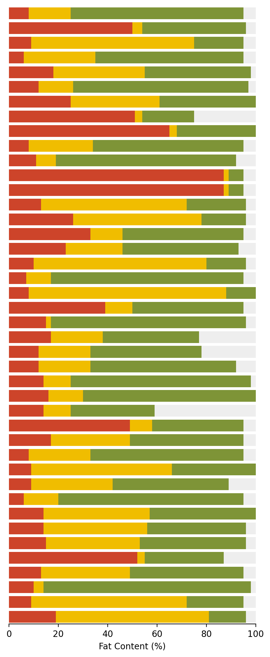
We use the add_layer()
to add the stack bar plot to the canvas.
Add side plots#
>>> oil_name = mp.Labels(data.index.str.capitalize())
>>> fmt = lambda x: f"{x:.1f}" if x > 0 else ""
>>> trans_fat = mp.Numbers(data['trans fat'] * 100, label="Trans Fat (%)",
...                        fmt=fmt, color=blue)
>>> cb.add_right(oil_name, size=1.1, pad=.2)
>>> cb.add_left(trans_fat, pad=.2, name="trans fat")
>>> cb.render()
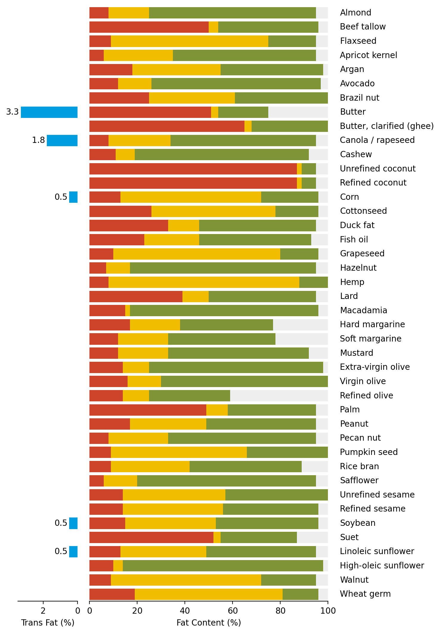
Here we use add_right() and
add_left() method to add texts and bar plot
to the right and left side of the stack bar plot. Adjustment of plot size
and space between plots is achieved with size and pad parameter.
The trans_fat is named with name parameter.
This name will be used later to retrieve the axes.
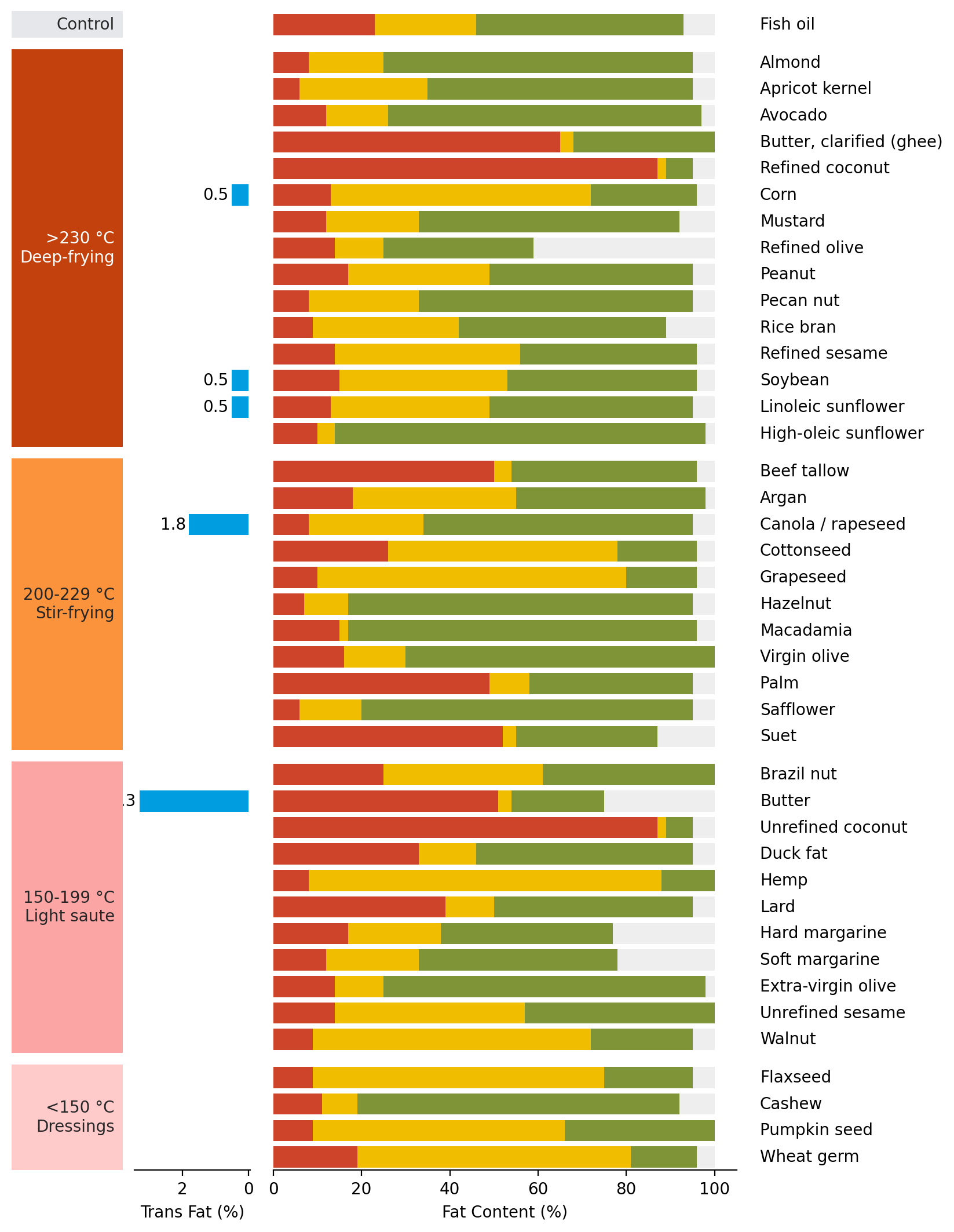
Grouping#
We split the data into groups based on the cooking conditions.
>>> order=["Control", ">230 °C (Deep-frying)", "200-229 °C (Stir-frying)",
...        "150-199 °C (Light saute)", "<150 °C (Dressings)"]
>>> group_color = ["#e5e7eb", "#c2410c", "#fb923c", "#fca5a5", "#fecaca"]
>>> cb.group_rows(data['cooking conditions'], order=order)
Add text to annotate the groups.
>>> chunk_text=["Control", ">230 °C\nDeep-frying", "200-229 °C\nStir-frying",
...             "150-199 °C\nLight saute", "<150 °C\nDressings"]
>>> cb.add_left(mp.Chunk(chunk_text, group_color, rotation=0, padding=10), pad=.1)
>>> cb.render()
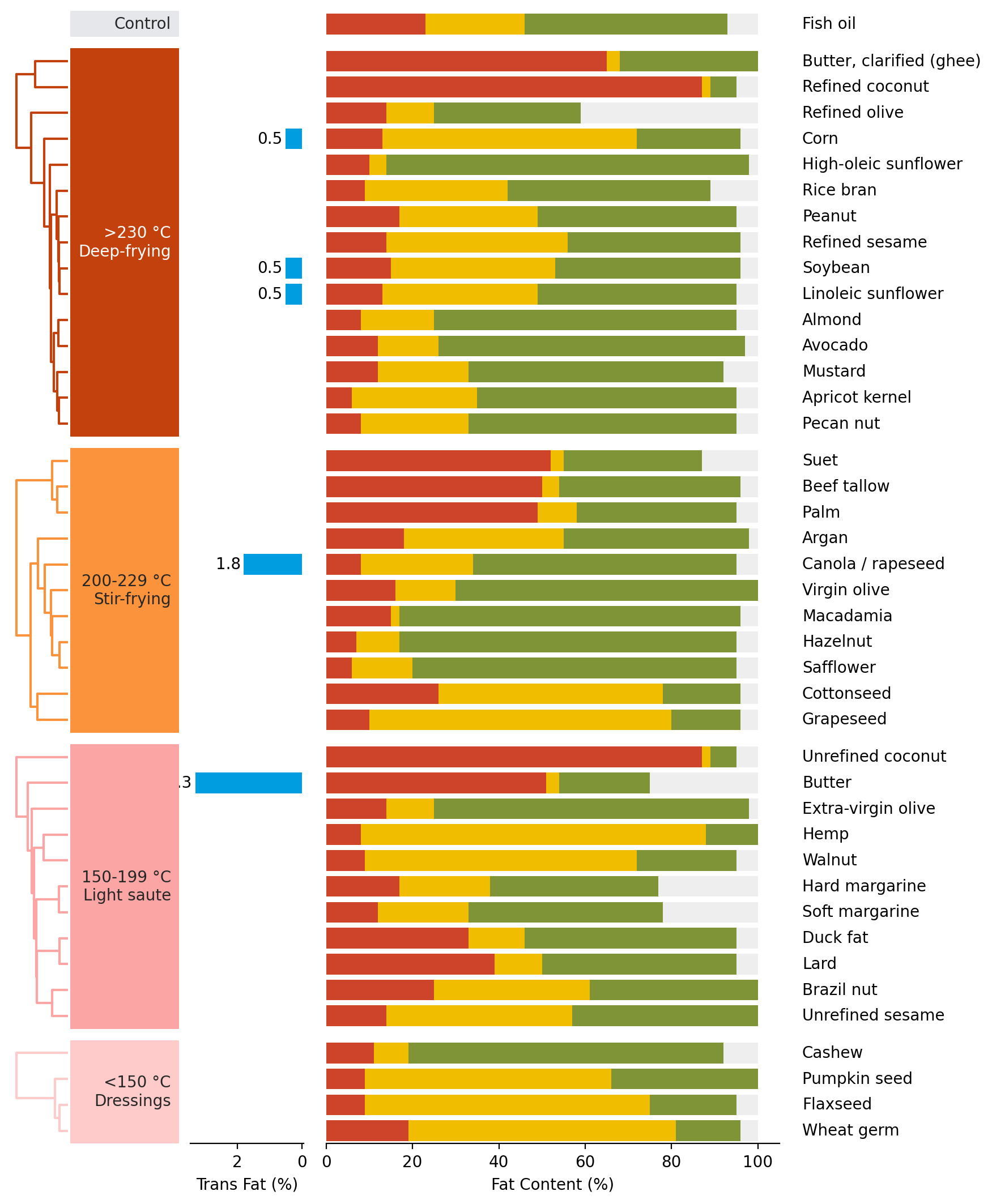
Add dendrogram#
Perform hierarchical clustering on the cooking oils within each group.
>>> cb.add_dendrogram("left", add_meta=False, colors=group_color,
...                   linewidth=1.5, size=.5, pad=.02)
>>> cb.render()
Add legends#
>>> cb.add_legends("bottom", pad=.3)
>>> cb.render()

Here we add the legends to the bottom of the canvas using
add_legends().
Make adjustment#
Notice that the text render in the Trans Fat (%) bar plot is outside of the plot. We can adjust the x-axis to make it fit.
Remember that we named this plot with name before.
We can retrieve the axes where the plot is drawn
using get_ax().
>>> cb.render()
>>> axes = cb.get_ax("trans fat")
>>> for ax in axes:
...     ax.set_xlim(4.2, 0)
The get_ax() will return a list of axes
if we group the data. Otherwise, it will return a single axes.