Introduction: Basic Concepts#
Marsilea is a powerful Python package that allows you to effortlessly create visually appealing X-layout visualization. X-layout visualization is designed specifically for multi-feature dataset.
This tutorial will guide you through the basic operation for creating a x-layout visualization.
Prerequisites#
This tutorial assumes that you have basic knowledge of Python, and you know how to use NumPy and Matplotlib.
If you are not familiar with these packages, you can check out the following links:
It’s recommended that you should be familiar with
the concept of Figure and
Axes in Matplotlib.
Create main visualization#
>>> import marsilea as ma
>>> import marsilea.plotter as mp
The shorthand convention for Marsilea is ma and for plotter is mp.
>>> data = np.random.randn(10, 6)
>>> cb = ma.ClusterBoard(data, height=2, margin=.5)
>>> cb.add_layer(mp.Violin(data, color="#FF6D60"))
>>> cb.render()
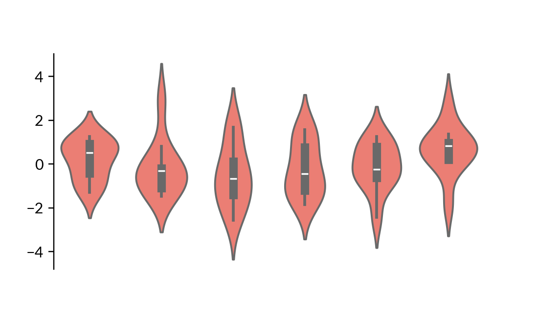
Firstly, we create a ClusterBoard to
draw the main visualization.
It’s an empty canvas that allows you to append plots to it.
The canvas is initialized with height of 2 and margin of .5.
The margin can be used to reserve white space around the canvas to avoid
clipping of visualization when you save the plot.
In Marsilea, if not specified, the unit is inches.
Afterwards, we use add_layer()
to add a Violin plot to the canvas.
Finally, the render()
is called to draw our visualization.
Grouping#
>>> cb.vsplit(labels=["c1", "c1", "c2", "c2", "c3", "c3"],
...           order=["c1", "c2", "c3"], spacing=.08)
>>> cb.render()
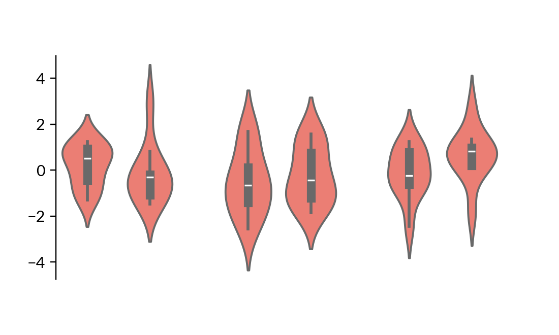
We use vsplit() to split the canvas into three groups.
The labels parameter specifies the gr oup for each column.
The order parameter specifies the order of the groups that will present in the plot.
Let’s add side plots to the groups to make it more visually distinct.
Here the spacing is the fraction of the width of the canvas.
Annotate with Additional components#
>>> group_labels = mp.Chunk(["c1", "c2", "c3"],
...                         ["#FF6D60", "#F7D060", "#F3E99F"])
>>> cb.add_top(group_labels, size=.2, pad=.1)
>>> cb.render()
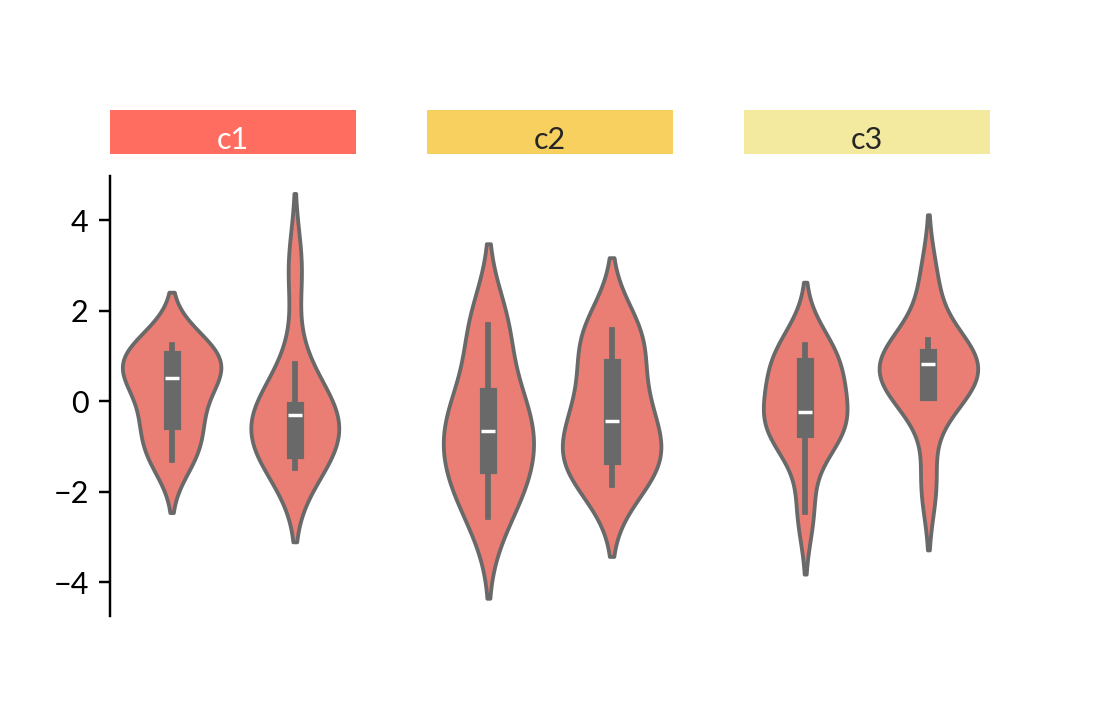
We use add_top() to
add a Chunk plot to the top of the canvas.
The Chunk plot is an annotation plot that use to annotate the groups.
You can use size and pad parameters to adjust the size
and the space between the plots. The unit is inches.
Note
For plot like Chunk which draws text,
the size of the plot will be automatically adjusted to fit the text,
so you don’t need to specify the size of the plot.
Hierarchical Clustering#
>>> cb.add_dendrogram("bottom", colors="g")
>>> cb.render()
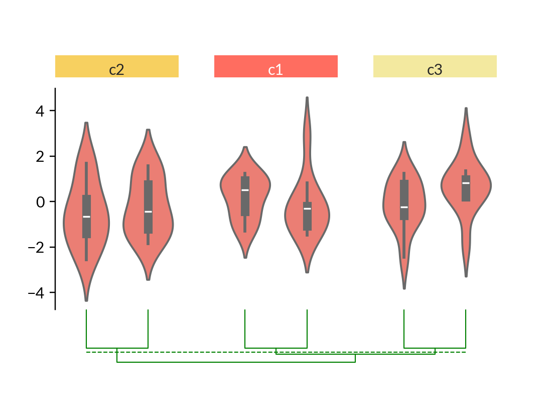
We use add_dendrogram() to
add a dendrogram to the bottom of the canvas.
The dendrogram is a tree-like diagram that records the hierarchical clustering process.
In Marsilea, the clustering can be performed on different visualizations not limited to
heatmap.
Here, you may notice that the order of the order of groups and the order within groups are automatically changed according to the clustering result.
Add bottom plot and title#
>>> cb.add_bottom(ma.plotter.Bar(data, color="#577D86"), size=2, pad=.1)
>>> cb.add_title(top="My First Marsilea Example")
>>> cb.render()
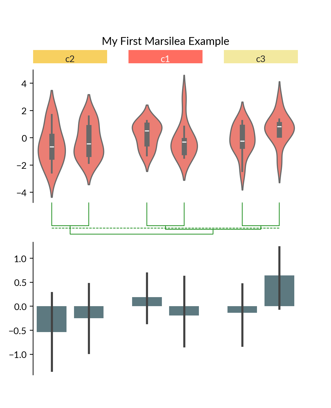
We can add more plots to the main visualization.
Here we add a Bar plot to the bottom and
a title to the top using add_title().
Save your visualization#
You can save it to a file using save().
>>> cb.save("my_first_marsilea_example.png")
Or you can save it like how you save all your matplotlib figure.
You can access figure object with .figure.
It’s recommended that you save it in the bbox_inches="tight" mode to avoid
clipping. Alternatively, you can increase the margin of the canvas.
>>> cb.figure.savefig("my_first_marsilea_example.png", bbox_inches="tight")
Summary#
To summarize, here is a list of methods you can use to control your visualization. Some of them will be introduced later.
Add to the main layer: add_layer()
Add to the side:
Left side:
add_left()Right side:
add_right()Top side:
add_top()Bottom side:
add_bottom()
Grouping:
Add dendrogram: add_dendrogram()
Add title: add_title()
Add legend: add_legends()
Save the plot: save()